
Colorblindness in data design

Inclusivity in design is a hot topic, and for good reason. As data designers, we should aim to create visuals that communicate effectively to everyone. But when it comes to data visualization, color blindness presents a unique challenge.
Even if certain colors can be distinguished, the emotional impact might be lost, and with that the interpretation of the data at most, or the user experience at least.
In this article, you’ll delve into the nuances of color blindness in data visualization. Read further to understand how to create truly inclusive designs that convey your message effectively.
The use of color in Data Visualization
Color has a unique communicative role in data designs. It helps us differentiate between data points, making it easier to identify trends and patterns at a glance.
Imagine a graph without color, just black and white – it would be much harder to extract meaningful insights quickly. But if you add color and play with hues (i.e. blue, red, yellow) and value (i.e. light or dark), the storytelling can be emphasized.
From merely showing data points in a comprehensible way, you communicate a specific message. Changes in hue effectively describe differences in categories, while changes in lightness describe differences in value.

Beyond its functional use, color also carries emotional weight. Some colors communicate a sentiment of urgency, while others communicate a sentiment of success. By strategically using bold or contrasting colors, we can draw attention to the most critical information or signal action is needed.
In data design color is thus used for distinguishing data points, communicating sentiment, signaling values and showing trends. Different colors evoke different feelings and associations. A well-chosen color palette can make data not just understandable, but also memorable.
Understanding color blindness
When using color as an element of communication, inclusivity is a crucial consideration. With a significant portion of the population — approximately 1 in 12 men and 1 in 200 women globally — experiencing some form of color blindness, our choice of colors must ensure that everyone can interpret the data accurately. This means selecting palettes that are distinguishable to all viewers, not just those with typical color vision.
So where to start?
To create truly inclusive data visualizations, it's essential to understand the different types of color blindness and how they affect perception. While the severity and type of color blindness can vary, the most common forms are red-green color blindness, blue-yellow color blindness, and total color blindness.

1. Red-green color blindness: This is the most prevalent form, affecting the ability to distinguish between reds, greens, browns, and oranges. There are two subtypes: protanopia (difficulty seeing red) and deuteranopia (difficulty seeing green). People with red-green color blindness often see these colors as similar shades, making it challenging to interpret visualizations that rely on these hues.
2. Blue-Yellow Color Blindness: Less common than red-green color blindness, blue-yellow color blindness includes tritanopia (difficulty seeing blue) and tritanomaly (difficulty distinguishing between blue and yellow). This type affects the ability to differentiate between blues and yellows, which can also pose challenges in data visualization.
3. Total Color Blindness: Also known as monochromacy, this rare condition results in seeing the world in shades of gray. Individuals with total color blindness cannot perceive any colors, making it crucial to use other visual cues like patterns, shapes, and textures in data visualizations to convey information effectively.
How to answer to color vision deficiency?
1. Use high contrast colors: High contrast colors are easier to distinguish in both dark and light modes. Make sure there is a significant difference in brightness and saturation between the colors you choose.
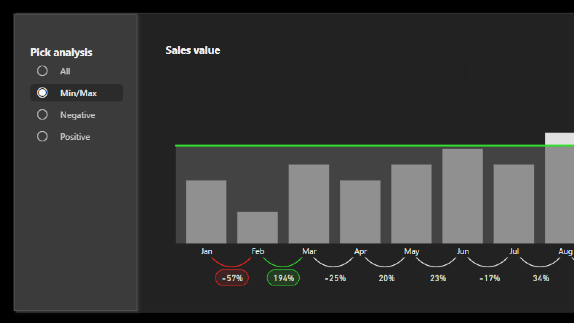
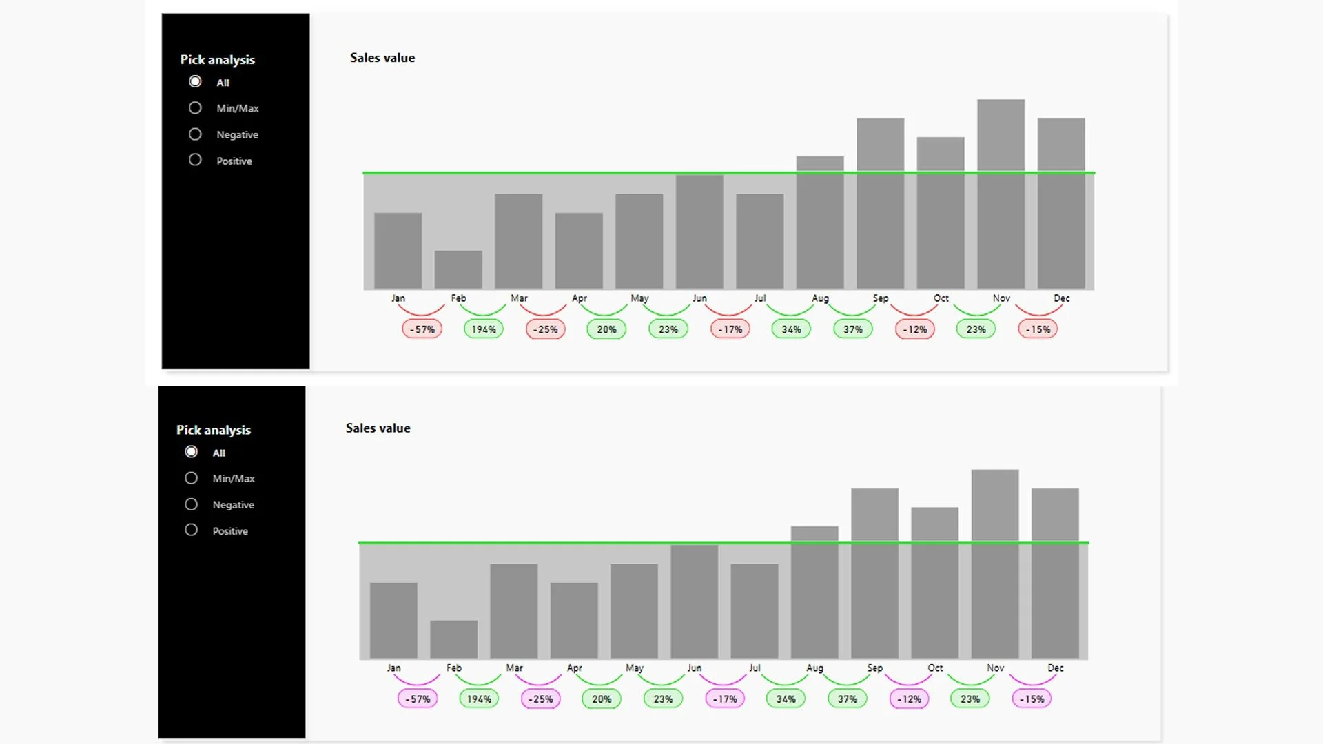
2. Use multiple visual cues: In addition to color, incorporate other visual cues like patterns, textures, shapes, and icons. This ensures that even if the colors are not easily distinguishable, the data can still be interpreted accurately. For example, using different line styles or patterns can help differentiate data points in a graph., and using icons can communicate sentiment.
3. Use accessible color palettes: Choose color palettes specifically designed for accessibility. Ensure that your chosen palette maintains its clarity and effectiveness in both dark and light modes.
4. Provide text labels and annotations: Adding text labels and annotations can enhance clarity and accessibility. Clearly label data points, legends, and key areas of your visualization. Descriptive text ensures that the information is understandable even without relying on color.
Conclusion
By considering the needs of colorblind individuals and employing thoughtful design strategies, you can create data visualizations that are accessible and effective for everyone.
Ensuring inclusivity in design not only broadens your audience but also enhances the clarity and impact of your work!